Hello!

This is Kaneko from Commit Ginza!
Today we'll be sharing some little tidbits about the current Daytona.

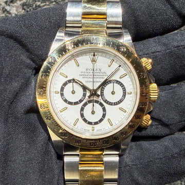
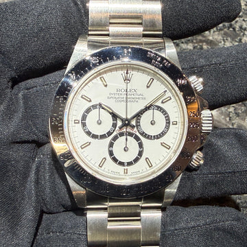
At first glance the current Daytona looks the same, but upon closer inspection there are differences.
The one on the left is marked November 2016. The one on the right is marked December 2019. If you look closely, you will see...
The thickness of the letters on the ceramic bezel is different.

The top is 2016 in bold, the bottom is 2019 in thin.

The top is 2016 in bold, the bottom is 2019 in thin.

How about 2016 in bold on the top and 2019 in thin print on the bottom?
When you compare them like this, you can see that the thickness of the letters is completely different, right?
Apparently, this has changed since 2018.

There are also differences in the texture of the dial and the thickness of the letters .

Will MK1 become stronger in the future? Let's keep an eye on future developments!
Well, I'll leave it here for today!